Wednesday, March 25, 2009

These babies are thumbnails for my next assignment in Illus. We're to design a cd jacket and a promotional flier that incorporates the jacket. I'm using my friends' garage-metal band Molten Sphinx, so I delved into the plethora of Egyptian symbols and images to create these. The final image will be a photoshop/photomanipulation beast, and I'm excited. Cd covers are probably my favorite thing to work on.


Once more my logo progress. Tom likes them both, although he prefers a different chicken than the larger ver. He likes the right-sided text one. My next step is to take these and design some business cards with 'em.


Wednesday, March 18, 2009


This is my pretty well finished The International poster. I might alter it some if critique dictates. Overall, I'm satisfied with the end result.


In graphic design 2, we each picked a kitchen utencil, did some research on it, and created a diptych composition from it. Although I was pleased with it, my class felt it had some unresolved problems dealing with the assignment. They also commented that the headliner font was too generic. We will make one more version of this piece, so I'll have to do a overhaul on it for next week.


Finally, my two-headed chicken logo. It needs some tweaking, but my Illustration internship boss really likes it.

Wednesday, March 11, 2009

spring break—not quite

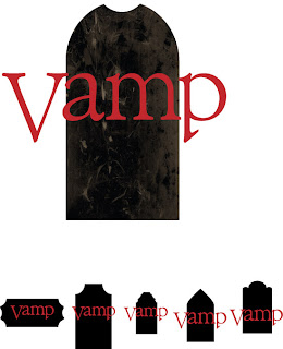
I'm still working on my logo. For the Vamp Co. idea, I've turned various fonts into outlines and adjusted the v's and p's to resemble fangs. I can see now that my geometric shape needs to be a little darker in order to read better.


Wednesday, March 4, 2009

The International


Our latest assignment in illustration is to see a recent movie and create an illustration that conveys what the movie is about. It also has to include a celebrity's portrait or caricature. I picked The International, with Clive Owen and Naomi Watts. It's a pretty good movie, even if Watt's character is completely pointless. That's why she didn't make it into my art. This sketch will be blown up to 10" x 14" and transferred to a art stock, on which I'll paint the final version.


These are more ideas for my personal logo. My internship boss asked me to pick a word that fits my personality and portray it as sort of "my own company" logo.


He also advised me to take some photos and experiment in Photoshop to see what I could do. I took an old picture of one of my family's chickens, and I gave her two heads. Then I used both Photoshop and Illustrator to create different versions and effects.